White Screen Free Script Download
Download White Screen Script for Free to make a website that can get thousands of free organic traffic from all countries.
What is White Screen?
White Screen is an online tool that is use to test computer and laptop screens online.
How Use The Code?
You can use this code directly in your existing WordPress website and also use as a custom website by uploading it directly to your hosting.
Why You Should Make A Website About White Screen?
- Search Volume = 1,220,000 Per Month
- Competition = Low
- Top Website are low DA and getting tons of organic traffic
CSS Code for White Screen Online
<!DOCTYPE html>
<html lang="en">
<head>
  <meta charset="UTF-8">
  <meta name="viewport" content="width=device-width, initial-scale=1.0">
  <title>Advanced White Screen</title>
  <style>
    /* Reset default styles */
    * {
      margin: 0;
      padding: 0;
      box-sizing: border-box;
    }

    /* Full-screen background */
    body {
      background-color: white;
      min-height: 100vh;
      font-family: 'Arial', sans-serif;
      transition: background 0.3s ease, filter 0.3s ease;
      display: flex;
      flex-direction: column;
    }

    /* Beautiful responsive menu */
    .navbar {
      position: fixed;
      top: 0;
      left: 0;
      width: 100%;
      background: rgba(255, 255, 255, 0.9);
      backdrop-filter: blur(10px);
      box-shadow: 0 4px 15px rgba(0, 0, 0, 0.1);
      display: flex;
      justify-content: space-between;
      align-items: center;
      padding: 10px 20px;
      z-index: 1000;
    }

    .navbar .logo {
      font-size: 24px;
      font-weight: bold;
      color: #007BFF;
    }

    .navbar .menu {
      display: flex;
      gap: 20px;
      align-items: center;
    }

    .navbar .menu a {
      text-decoration: none;
      color: #333;
      font-size: 16px;
      transition: color 0.3s ease;
    }

    .navbar .menu a:hover {
      color: #007BFF;
    }

    .navbar .menu-icon {
      display: none;
      font-size: 24px;
      cursor: pointer;
    }

    /* Hide menu in fullscreen mode */
    .fullscreen .navbar {
      opacity: 0;
      pointer-events: none;
    }

    /* Responsive menu for mobile */
    @media (max-width: 768px) {
      .navbar .menu {
        display: none;
        flex-direction: column;
        position: absolute;
        top: 60px;
        right: 20px;
        background: rgba(255, 255, 255, 0.9);
        backdrop-filter: blur(10px);
        border-radius: 10px;
        box-shadow: 0 4px 15px rgba(0, 0, 0, 0.1);
        padding: 10px;
      }

      .navbar .menu.active {
        display: flex;
      }

      .navbar .menu-icon {
        display: block;
      }
    }

    /* White screen area */
    .white-screen {
      flex: 1;
      display: flex;
      justify-content: center;
      align-items: center;
      width: 100%;
      height: calc(100vh - 60px); /* Adjust for navbar height */
      margin-top: 60px; /* Space for the navbar */
    }

    /* Floating control panel */
    .controls {
      position: fixed;
      bottom: 20px;
      left: 50%;
      transform: translateX(-50%);
      background: rgba(255, 255, 255, 0.9);
      padding: 15px;
      border-radius: 15px;
      box-shadow: 0 4px 15px rgba(0, 0, 0, 0.2);
      display: flex;
      gap: 10px;
      align-items: center;
      backdrop-filter: blur(10px);
      transition: opacity 0.3s ease;
    }

    /* Hide controls in fullscreen mode */
    .fullscreen .controls,
    .fullscreen .hint {
      opacity: 0;
      pointer-events: none;
    }

    .controls button {
      background: #007BFF;
      color: white;
      border: none;
      padding: 10px 15px;
      border-radius: 8px;
      cursor: pointer;
      font-size: 14px;
      transition: background 0.3s ease, transform 0.2s ease;
    }

    .controls button:hover {
      background: #0056b3;
      transform: scale(1.05);
    }

    .controls input[type="range"] {
      cursor: pointer;
    }

    .controls label {
      font-size: 14px;
      color: #333;
    }

    /* Keyboard shortcut hint */
    .hint {
      position: fixed;
      top: 70px;
      left: 50%;
      transform: translateX(-50%);
      background: rgba(255, 255, 255, 0.9);
      padding: 10px 20px;
      border-radius: 8px;
      box-shadow: 0 4px 10px rgba(0, 0, 0, 0.1);
      font-size: 14px;
      color: #333;
      backdrop-filter: blur(10px);
      transition: opacity 0.3s ease;
    }

    /* Responsive adjustments for controls */
    @media (max-width: 768px) {
      .controls {
        flex-direction: column;
        padding: 10px;
        gap: 8px;
      }

      .controls label {
        font-size: 12px;
      }

      .controls button {
        padding: 8px 12px;
        font-size: 12px;
      }

      .hint {
        top: 60px;
        font-size: 12px;
        padding: 8px 16px;
      }
    }
     /* About Section Styling */
  .about-section {
    padding: 60px 20px;
    background: linear-gradient(135deg, #f9f9f9, #ffffff);
    border-radius: 15px;
    margin: 40px auto;
    max-width: 1200px;
    box-shadow: 0 8px 32px rgba(0, 0, 0, 0.1);
  }

  .container {
    max-width: 1000px;
    margin: 0 auto;
  }

  .section-title {
    font-size: 36px;
    font-weight: bold;
    color: #007BFF;
    text-align: center;
    margin-bottom: 40px;
    position: relative;
  }

  .section-title::after {
    content: '';
    display: block;
    width: 60px;
    height: 4px;
    background: #007BFF;
    margin: 10px auto 0;
    border-radius: 2px;
  }

  .content-grid {
    display: grid;
    grid-template-columns: repeat(auto-fit, minmax(300px, 1fr));
    gap: 30px;
  }

  .content-card {
    background: white;
    padding: 25px;
    border-radius: 15px;
    box-shadow: 0 4px 20px rgba(0, 0, 0, 0.1);
    transition: transform 0.3s ease, box-shadow 0.3s ease;
  }

  .content-card:hover {
    transform: translateY(-10px);
    box-shadow: 0 8px 30px rgba(0, 0, 0, 0.15);
  }

  .card-title {
    font-size: 24px;
    font-weight: bold;
    color: #333;
    margin-bottom: 15px;
  }

  .card-text {
    font-size: 16px;
    color: #555;
    line-height: 1.6;
  }

  .usage-list {
    list-style: none;
    padding: 0;
    margin: 0;
  }

  .usage-list li {
    font-size: 16px;
    color: #555;
    margin-bottom: 10px;
    padding-left: 20px;
    position: relative;
  }

  .usage-list li::before {
    content: '•';
    position: absolute;
    left: 0;
    color: #007BFF;
    font-size: 20px;
  }

  /* Responsive Design */
  @media (max-width: 768px) {
    .section-title {
      font-size: 28px;
    }

    .card-title {
      font-size: 22px;
    }

    .card-text {
      font-size: 14px;
    }

    .usage-list li {
      font-size: 14px;
    }
  }
  </style>
HTML Code of White Screen
<body>
<!-- Beautiful responsive menu -->
<nav class="navbar">
<div class="logo">WhiteScreen</div>
<div class="menu">
<a href="#">Home</a>
<a href="#">About Us</a>
<a href="#">Contact Us</a>
<a href="#">Privacy Policy</a>
<a href="#">Terms & Conditions</a>
</div>
<div class="menu-icon" onclick="toggleMenu()">☰</div>
</nav>
<!-- White screen area -->
<div class="white-screen"></div>
<!-- Keyboard shortcut hint -->
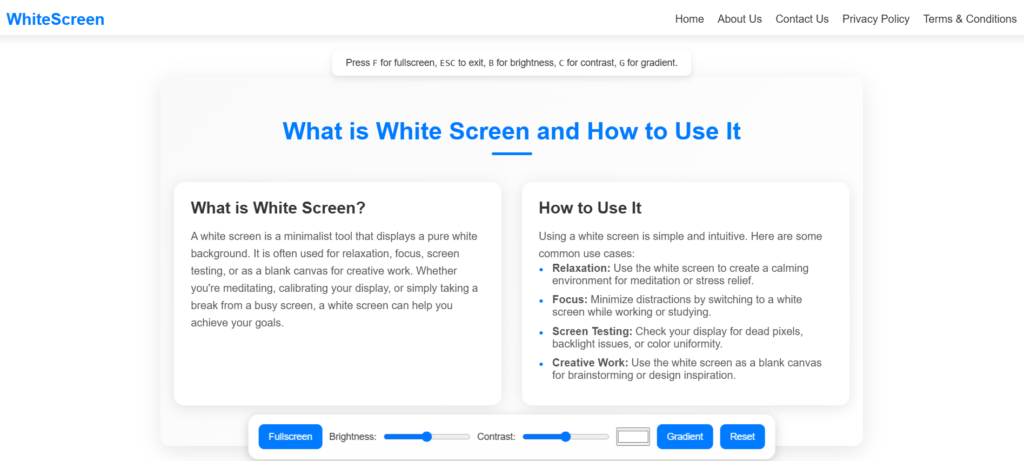
<div class="hint">
Press <kbd>F</kbd> for fullscreen, <kbd>ESC</kbd> to exit, <kbd>B</kbd> for brightness, <kbd>C</kbd> for contrast, <kbd>G</kbd> for gradient.
</div>
<!-- Control panel -->
<div class="controls">
<button id="fullscreen">Fullscreen</button>
<label for="brightness">Brightness:</label>
<input type="range" id="brightness" min="0" max="200" value="100">
<label for="contrast">Contrast:</label>
<input type="range" id="contrast" min="0" max="200" value="100">
<input type="color" id="colorPicker" value="#ffffff">
<button id="gradient">Gradient</button>
<button id="reset">Reset</button>
</div>
<!-- What is White Screen and How to Use It Section -->
<section class="about-section">
<div class="container">
<h2 class="section-title">What is White Screen and How to Use It</h2>
<div class="content-grid">
<!-- What is White Screen -->
<div class="content-card">
<h3 class="card-title">What is White Screen?</h3>
<p class="card-text">
A white screen is a minimalist tool that displays a pure white background. It is often used for relaxation, focus, screen testing, or as a blank canvas for creative work. Whether you're meditating, calibrating your display, or simply taking a break from a busy screen, a white screen can help you achieve your goals.
</p>
</div>
<!-- How to Use It -->
<div class="content-card">
<h3 class="card-title">How to Use It</h3>
<p class="card-text">
Using a white screen is simple and intuitive. Here are some common use cases:
</p>
<ul class="usage-list">
<li><strong>Relaxation:</strong> Use the white screen to create a calming environment for meditation or stress relief.</li>
<li><strong>Focus:</strong> Minimize distractions by switching to a white screen while working or studying.</li>
<li><strong>Screen Testing:</strong> Check your display for dead pixels, backlight issues, or color uniformity.</li>
<li><strong>Creative Work:</strong> Use the white screen as a blank canvas for brainstorming or design inspiration.</li>
</ul>
</div>
</div>
</div>
</section>JavaScript Code for White Screen Online
<script>
    // Get DOM elements
    const body = document.body;
    const fullscreenButton = document.getElementById('fullscreen');
    const brightnessSlider = document.getElementById('brightness');
    const contrastSlider = document.getElementById('contrast');
    const colorPicker = document.getElementById('colorPicker');
    const gradientButton = document.getElementById('gradient');
    const resetButton = document.getElementById('reset');
    const menu = document.querySelector('.navbar .menu');

    // Toggle menu for mobile
    function toggleMenu() {
      menu.classList.toggle('active');
    }

    // Fullscreen functionality
    fullscreenButton.addEventListener('click', () => {
      if (!document.fullscreenElement) {
        document.documentElement.requestFullscreen();
      } else {
        document.exitFullscreen();
      }
    });

    // Handle fullscreen change events
    document.addEventListener('fullscreenchange', () => {
      if (document.fullscreenElement) {
        body.classList.add('fullscreen');
      } else {
        body.classList.remove('fullscreen');
      }
    });

    // Exit fullscreen on ESC key
    document.addEventListener('keydown', (e) => {
      if (e.key === 'Escape' && document.fullscreenElement) {
        document.exitFullscreen();
      }
    });

    // Update brightness and contrast
    brightnessSlider.addEventListener('input', () => {
      body.style.filter = `brightness(${brightnessSlider.value}%) contrast(${contrastSlider.value}%)`;
    });

    contrastSlider.addEventListener('input', () => {
      body.style.filter = `brightness(${brightnessSlider.value}%) contrast(${contrastSlider.value}%)`;
    });

    // Update background color
    colorPicker.addEventListener('input', () => {
      body.style.backgroundColor = colorPicker.value;
    });

    // Set gradient background
    gradientButton.addEventListener('click', () => {
      const color1 = prompt('Enter first color for gradient (e.g., #FFFFFF):');
      const color2 = prompt('Enter second color for gradient (e.g., #000000):');
      if (color1 && color2) {
        body.style.background = `linear-gradient(45deg, ${color1}, ${color2})`;
      }
    });

    // Reset to default
    resetButton.addEventListener('click', () => {
      body.style.backgroundColor = 'white';
      body.style.background = 'white';
      body.style.filter = 'brightness(100%) contrast(100%)';
      brightnessSlider.value = 100;
      contrastSlider.value = 100;
      colorPicker.value = '#ffffff';
    });

    // Keyboard shortcuts
    document.addEventListener('keydown', (e) => {
      if (e.key === 'f' || e.key === 'F') {
        fullscreenButton.click();
      } else if (e.key === 'b' || e.key === 'B') {
        brightnessSlider.focus();
      } else if (e.key === 'c' || e.key === 'C') {
        contrastSlider.focus();
      } else if (e.key === 'g' || e.key === 'G') {
        gradientButton.click();
      } else if (e.key === 'r' || e.key === 'R') {
        resetButton.click();
      }
    });
    // Handle fullscreen change events
document.addEventListener('fullscreenchange', () => {
  if (document.fullscreenElement) {
    // Hide all elements except the white screen
    document.querySelectorAll('body > *').forEach((element) => {
      if (!element.classList.contains('white-screen')) {
        element.style.display = 'none';
      }
    });
  } else {
    // Show all elements when exiting fullscreen
    document.querySelectorAll('body > *').forEach((element) => {
      element.style.display = '';
    });
  }
});
  </script>
</body>
</html>